Cookie Consent Management
FSU websites are required to display a cookie consent banner.
The banner gives visitors the ability to control how their personal data is collected and used and ensures the university adheres to international privacy and security laws.
Overview
Launched in 2016, Drupal's mobile first WCMS offers a host of new features and functionality, including customizable forms, multilingual sites and social media integration.
How is FSU Drupal branded?
Drupal will be branded based on University Communications guidelines for web styles. Learn more about FSU Branding.
Why FSU chose Drupal
The new system was selected after months of committee research to replace eZ Publish as the university’s central WCMS.
Advantages of using Drupal
It incorporates familiar editing tools — similar to those found in Microsoft Word documents — to allow non-technical users to easily and efficiently publish content and edit websites.
The Web Design team offers training and assistance with your WCMS website.
Please review the videos and information on using your WCMS Site below. Then, if you have further questions, contact the Web Design team or submit a support request.
Resources
Request a Site
Choose a color theme for your site from the selection below. ITS Web Services must configure this, so please include your preference when you request a Drupal site. If no choice is specified your site will default to the Garnet theme.
Color Themes
Header and footer are displayed.
 Garnet

 Gold
Gold

 Black
Black

 White
White

Adding Content
Content Types are how site editors can input original content on a Drupal site. Drupal has several different content types, which are explained in the Content Types section.
How to Add content to your site
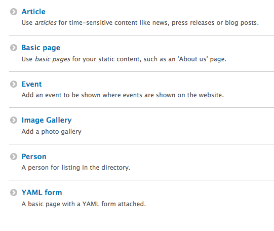
The WCMS has two ways to add content to the site. Either option will show the same content types.
Option 1:
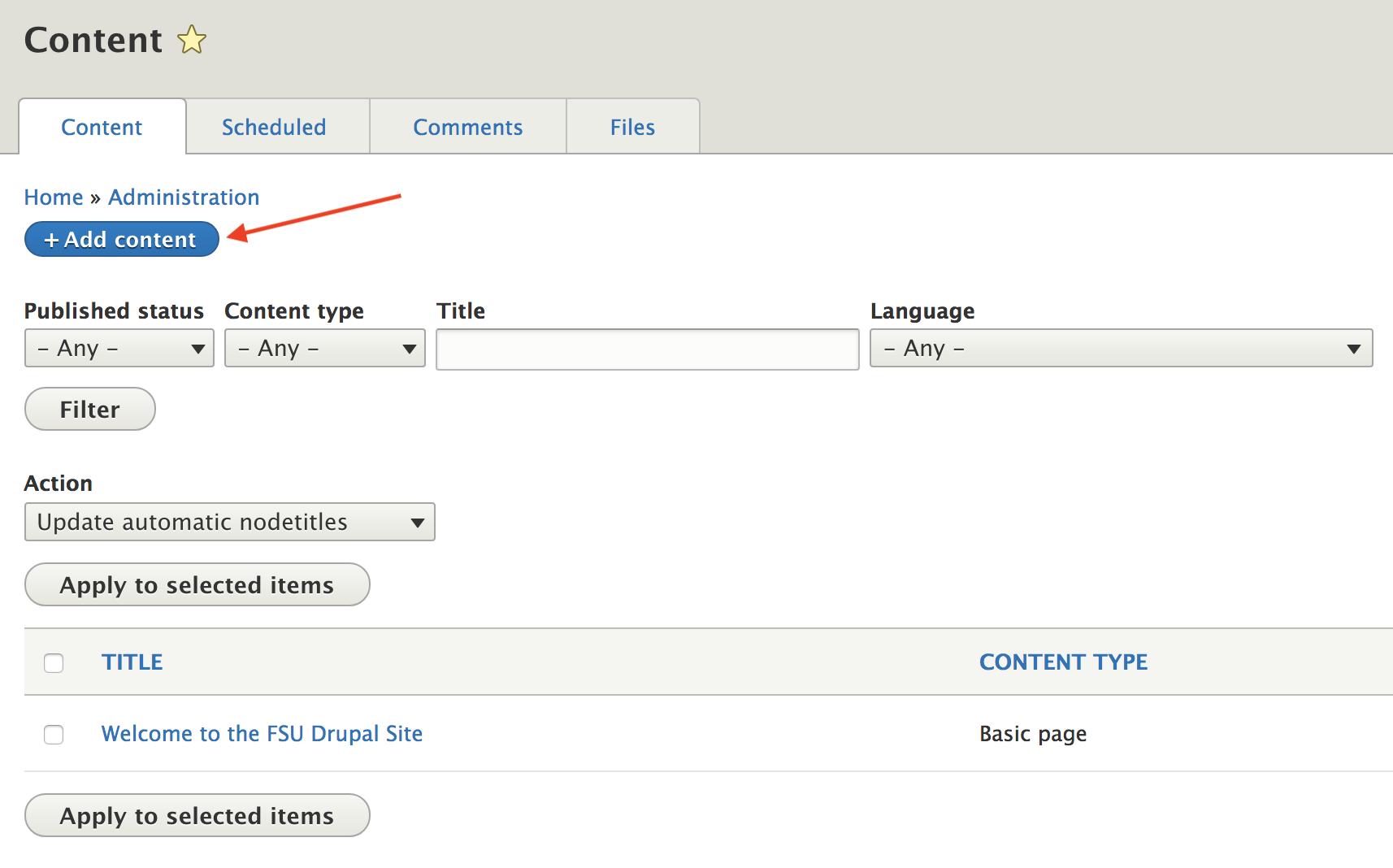
- Click on the Content link in the Drupal toolbar at the top of the page.
- Click on the +Add content button.
- Click on the desired content type to create a new piece of content.
option 2:
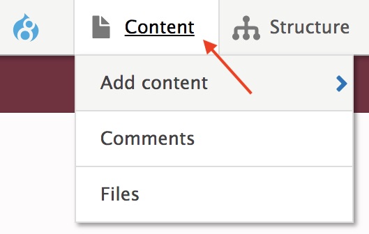
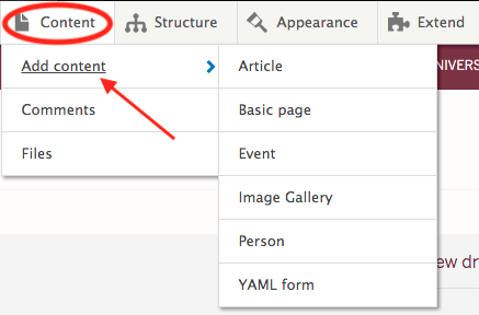
- Mouse over the Content tab
- Scroll down to Add content.
- Click on the desired content type to create a new piece of content.
Edit an Existing Piece of Content
There are two ways to edit an existing piece of content.
option 1:
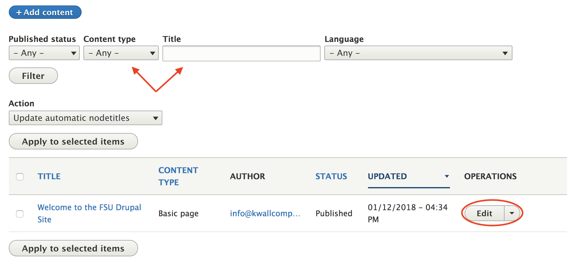
- Click on the Content tab.
- This will give you a list of all of your content.
- If the content item you want to edit was updated or created recently, it should appear near the top of the content list on that page. If not, you can use the Content type, Title, or other filters to locate the content item.
- Click Editin the row of the content item to open the content editing form.

option 2:
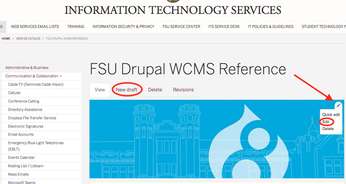
- Use the site's navigation menus to locate the page where the content you want to edit is displayed. Or, type in the URL of the page that you would like to edit.
- Click on the New Draft tab.
- Or, mouse over the top right corner of the content area to reveal the pencil icon.
- Click on the pencil to show options and select Edit.
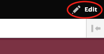
- If you have trouble finding the pencil icon, click on the Edit button in the upper right corner to display all of edit pencil icons on the page.
Publish Content
Depending on the content type, there may be some fields that are required. All of these fields are located in the left column. We will take a look at each content type in the Content Types section and go over each field in the left column.
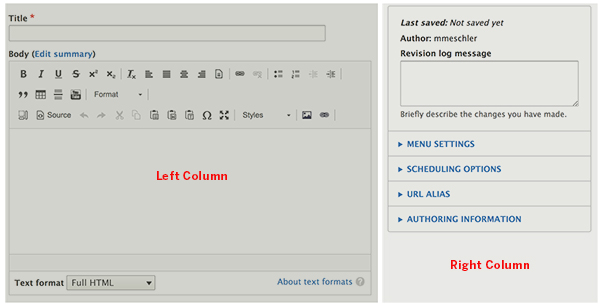
In the right column, you will see the Revision log message and several drop-downs. Again, depending on the content type, these drop-down options may be different.
Revision log message
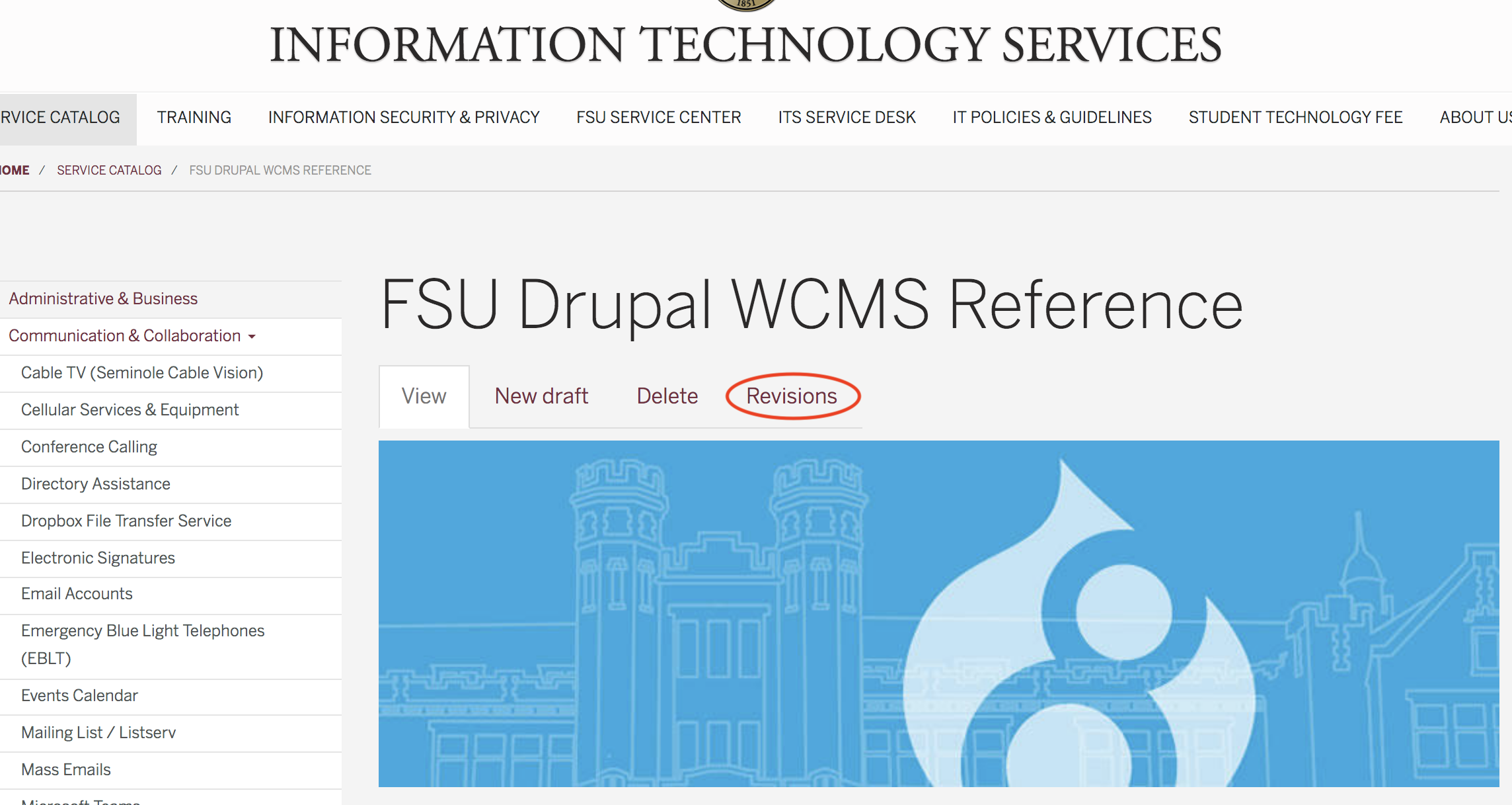
You may add a log message if you want. The messages can be viewed when you click on the Revisionstab while editing a page.
Menu Settings
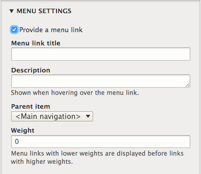
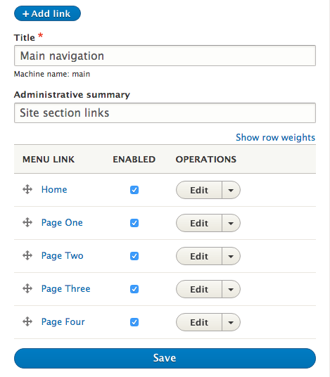
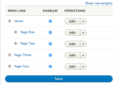
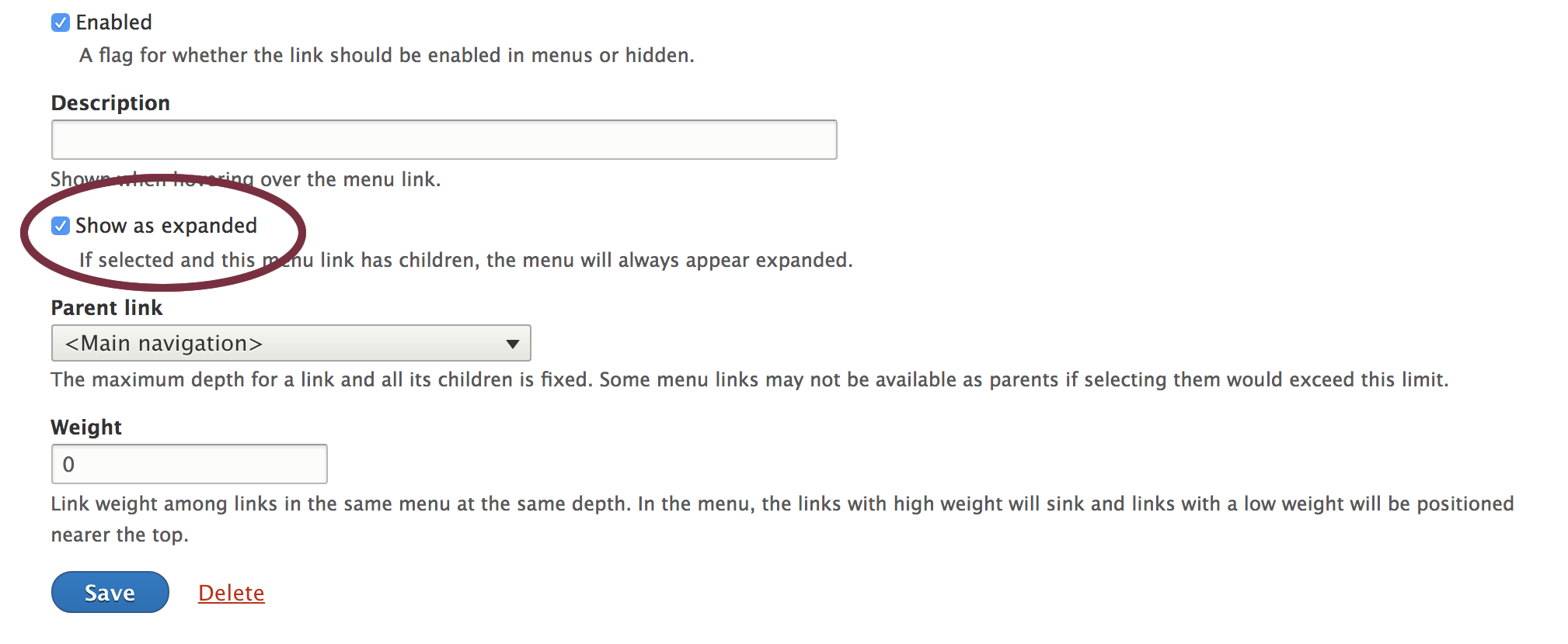
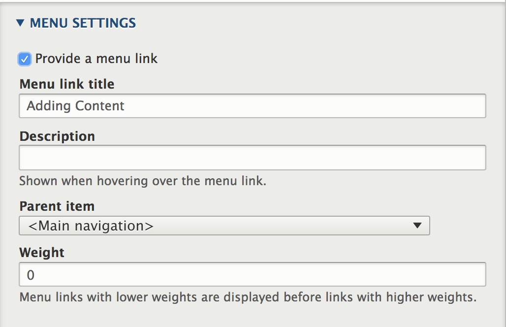
To create a menu link on your site, click on Provide a menu link. The Menu link title will automatically be populated with the title of the piece of content. Select the Parent item you wish to display the link under. If you choose <Main navigation> your link will be displayed at the top of the page. And, finally, you can add the Weight, which will arrange the links in a certain order. However, you may find it easier to navigate to Structure > Menus > Main Navigation to arrange menu links in the order you prefer. Here, you can drag the "+" icon to vertically to rearrange the menu items. You can also drag the items to the right to create subitems. For more information on this area, please go to the menu section.

Scheduling Options
The scheduling module appears to conflict with another module and is currently not working.
URL Alias
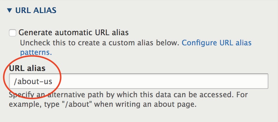
In this section, if you uncheck Generate automatic URL alias, you can add an alternative path to the content. Make sure to use the ;path and not the full URL. A path is the unique, last part of the URL for a specific function or piece of content. For example, if you have an "About Us" page and want the path to be http://yoursite/about-us, then add /about-us to the URL alias field.
Publish the Content
Once you have finished filling out all of the fields in the content type, scroll down to the bottom the page and choose one of the following options:
- Save and Create New Draft
- Save and Publish
- Save and Archive
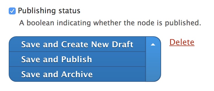
IMPORTANT NOTE: You will notice the Delete link in the image above. Please be very careful when deleting content, because it will be deleted immediately and cannot be retrieved.
Content Types
Your site can contain many different types of content. Each content type is comprised of a set of fields for a particular type of data. For example, the content types Basic Page, Person, and Article each have their own set of fields that pertain to that kind of content.
The content types for the FSU Drupal CMS are discussed below. We will review the fields in the left column that are specifically used for each content type. To review the fields in the right column, please go to the Adding Content section.

Adding Images or Files
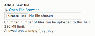
There are two ways to add images or files to your page — you can upload from the file browser or from your desktop. It is recommended to upload to the file browser. By doing so, the image or file can be placed in a file directory of your choosing, making it easier to locate and use again, if needed. If uploaded from the desktop using the Choose File option, the system will automatically add it to a file directory that uses the year and month that the image or file was uploaded.
Slides
The Basic Page and Article content types have a Slides section that allows you to add a slide carousel to the top of the page. Note that by filling out this section the slide carousel will only be on this Basic pageor Article that you are editing. To create a slideshow that is displayed on several pages, use one of the Custom Blocks. The slideshow for the Basic Page and Articleis very similar to the custom block Slider with Description Below Image.
Fields:
- Slide Image: Upload from the file browser or from your desktop. Recommended image size is 1200 pixels wide by the height of your choice. Banner height is dependent upon image height. So, be sure to make all slides the same size.
- Video Slide: A video can be added to the slideshow. However, it is recommended that if a video is added there should only be one slide. If there are multiple slides and the video is playing on the first slide and slider advances to the next slide, the video will continue to play on the second slide.
- Title, Subtitle, and Title box containing URL and Link text: If these fields are filled out, the text will be displayed below the image in a canvas colored box.
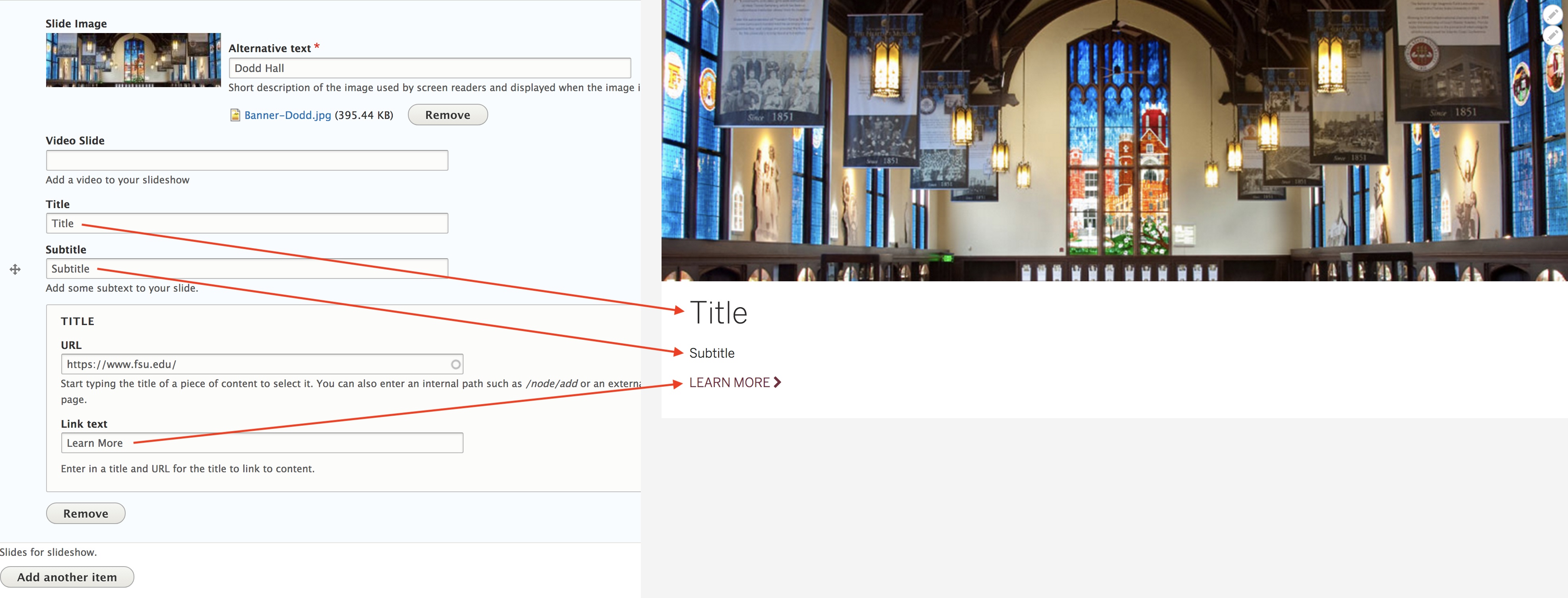
In the Title box, if only the URL field is filled out and the Link text field is left blank, the words "Read More" will automatically be populated on your banner. To overwrite "Read More," simply fill out the Link Text field. If all of these fields are left blank, then only the image will show. - Add another item button: Click on this button to add another slide. If only one slide is added, your banner will appear as a static image.
additional fields Or Custom Content Types
Web Services can assist in creating additional fields for existing content types or create custom content types should they be needed for your site.
Article Basic Page Event Image Gallery Person
Article
Articles are generally used for information that is updated more frequently and often cross-referenced and categorized (such as news items or resources). Articles may be displayed just like a Basic Page, essentially a page of content. However, the Article content type can also be displayed in what Drupal refers to as a View, or a feed. By default, an Article View has been set up for you.
- Create one or more Articles
- Go to http://yoursite/news
The articles are sorted with the most recent post at the top, an image in the left column and the Title, Article Date, and Summaryin the right column. This is very similar to the View or feed that can be done within the Basic Page Feeds section News One Column. The Title in the View will link to the fullArticle.

However, if your site requires that the Articles be sorted in a particular way, please contact Web Services and we can customize the View for you.
Image
If an image is uploaded to this field, it will be placed at the top of the page, below the title of the page.
Title
The Title field is the only required field. The Title will appear at the top of the published page.
Article Date
The Article Date will appear under the Title of the published page.
Category
This is where you enter taxonomy terms that will categorize this particular article. However, you will need to create your categories first.
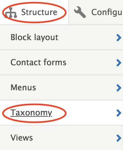
- Mouse over the Structure tab
- Click on Taxonomy
- Click on List terms in the News Categoriesrow
- Click on +Add term

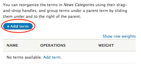
Now that you have added your taxonomy terms (category names) you can now add those names to the Categoryfield. Once you start typing the category name, the system will auto-complete the name.
The category names will be displayed at the bottom of the page. Each name will link to a taxonomy term page view, or feed. For example, if you have several articles that have the category name "Press Release" and you click on that name, it will take you to page titled "Press Release" and bring in all of the articles that have that same category name. By default, it will bring in the Title and Bodyof the article.
If you would prefer to have different fields brought into this view, or feed, please contact ITS Web Services.
Body
Add the content for the Article in the Bodyfield.
External URL
The URL will be displayed at the bottom of the page. If the Link text field is left blank, then the URL will be displayed. If it is filled out, then the link text will be displayed.
Tags
The tags field is very similar to the category field, where it too utilizes taxonomy terms. However, in the case of tags, you are able to add any taxonomy term, or tag name to the field. You do not have to create the tag names first, like you did with the category field.
The tag names will be displayed at the bottom of the page. Each name will link to a taxonomy term page view, or feed. For example, if you have several articles that have been tagged with "FSU: and you click on that name, it will take you to page titled "FSU" and bring in all of the articles that have that same tag name. By default, it will bring in the Title and Body of the article.
File
The file link will be added to the bottom of the page. It will be displayed as the file name and the size of the file.
Feature
If you are utilizing the view, or feed, feature and would like this particular article to be at the top of the view, check this box.
Basic Page
Typically, Basic pages are used for static content that can (but are not required to) be linked into the main navigation bar. This is one of the most "basic" content types and can be very flexible.
Title and Body
The Title field is the only required field. The Title will appear at the top of the published page. Add the content for the page in the Body field.
Embedded Galleries
To embed an image gallery, an instance of the Image Gallery content type must be created first. Start typing the instance name of Image Gallery content type in the field and it will auto complete the name.
Feeds
In this section a basic person or news feed can be added to the page. Drupal refers to these feeds as Views. Instances of Person and the Article content type must be created first.
Fields:
- Feed Heading: Enter the title of the feed here.
- Heading Placement and Alignment: Title Inside or Title Outside. The "inside" and "outside" terms refer to the placement of the title if you choose a Background Color for the feed. Title Outside will place the title outside the background color and left-align the title. Title Inside will place the title inside the background color and center-align the text.

- Title ARIA Heading Level: The heading level indicates to assistive technologies that this element should be treated like a heading. Screen readers, for example, will read the text and indicate that this text is formatted like a heading. The level number lets the assistive technology know which part of the page structure this heading represents. A level 1 heading usually indicates the main heading of a page, a level 2 heading the first sub section, a level 3 would then be a sub section of that, and so on.
- Background Color: Choose a background color for your feed. For a key to the color names, go Web Style Guide.
- Custom CSS Class: For advanced users only. Please contact ITS Web Services for details.
- Views Field: News One Column, People Two Col, People Two Col (Circle Photos), People One Col (Large Photos). Choose one of these options from the drop-down. As stated above, instances of the article content type must first be created in order to show the News One Column view. Instances of the person content type must be created to show People Two Col, People Two Col (Circle Photos), People One Col (Large Photos).
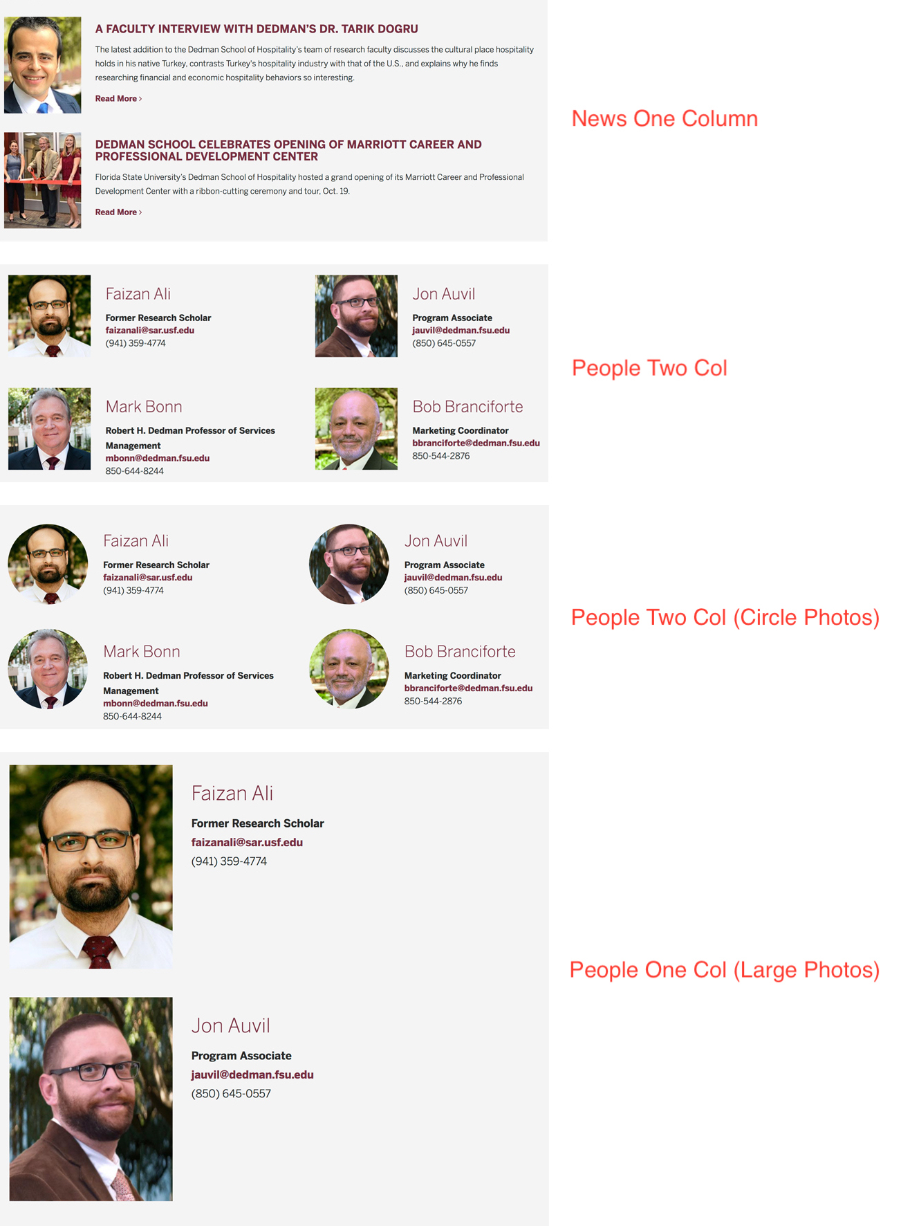
- Arguments: This field will need to be configured by ITS Web Services.
Event
The Event content type is available to create calendar events. However, we encourage all departments to use the integrated FSU Events Calendar. You can also go to the ITS Service Catalog, to find out more information about FSU Events Calendar. Should you need to create events within Drupal please contact Web Services to discuss your options.
Image Gallery
The Image Gallery can be displayed as a stand alone content type or can be embedded within the Basic Page in the Embedded Galleries section.
Title
The Title field is the only required field. The Title will appear at the top of the published page.
Body
The Body text will appear above the images.
Gallery Image
Upload all the images for your image gallery in this section.
Person
The Person content type can be used to create faculty and staff profiles, including photo, contact information and text. A Person page may be displayed just like a Basic Page, essentially a page of content. However, the Person content type can also be displayed in what Drupal refers to as a View, or a feed. By default, a Person View has been set up for you.
- Create one or more Person content types
- Go to http://yoursite/directory
The person directory is sorted alphabetically by last name, and in two columns. If filled out, the following fields will be visible: Image, Name, Title, Position, Department, Email, and Phone. This is very similar to the View or feed that can be done within the Basic Page Feeds section People Two Column. The Name in the View will link to the full Person page.
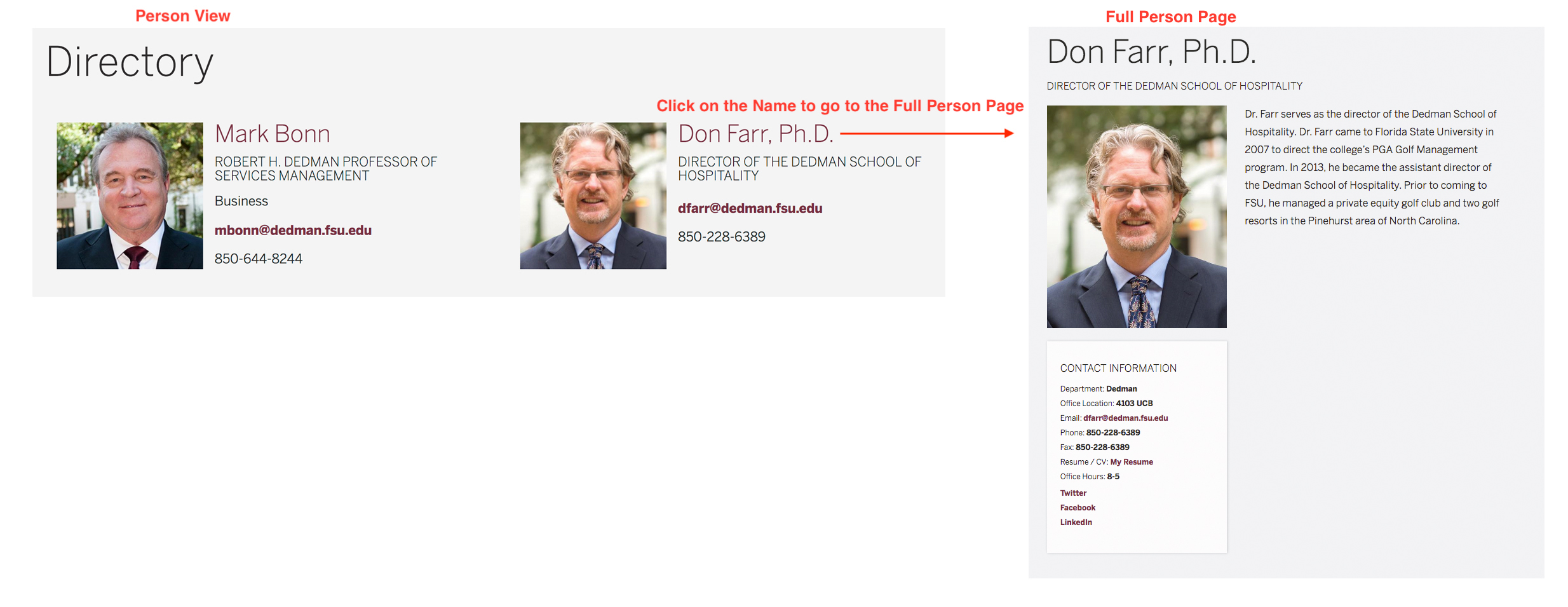
However, if your site requires that the Person content types be sorted in a particular way, please contact Web Services and we can customize the View for you.
Most of the fields in the Person content type are self explanatory. If the following fields are filled out, they will appear in the Contact Information box: Email, Department, Office Location, Office Hours, Phone, Fax, Resume, and Social Media.
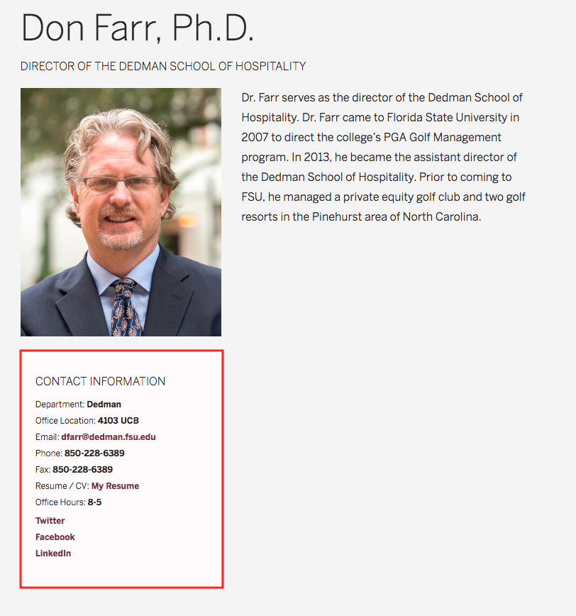
The First Name and Last Name will appear at the top of the page. If the Credential field is filled out, it will automatically be appended to the name. The Position field is directly below the name. The Body text is to the right of the photo.
Regions
The following image illustrates the various block regions that can be used to display your content in the FSU Drupal template. (You can view the demonstration page on your own site by navigating to Structure > Block layout and clicking on the Demonstrate block regions text.)
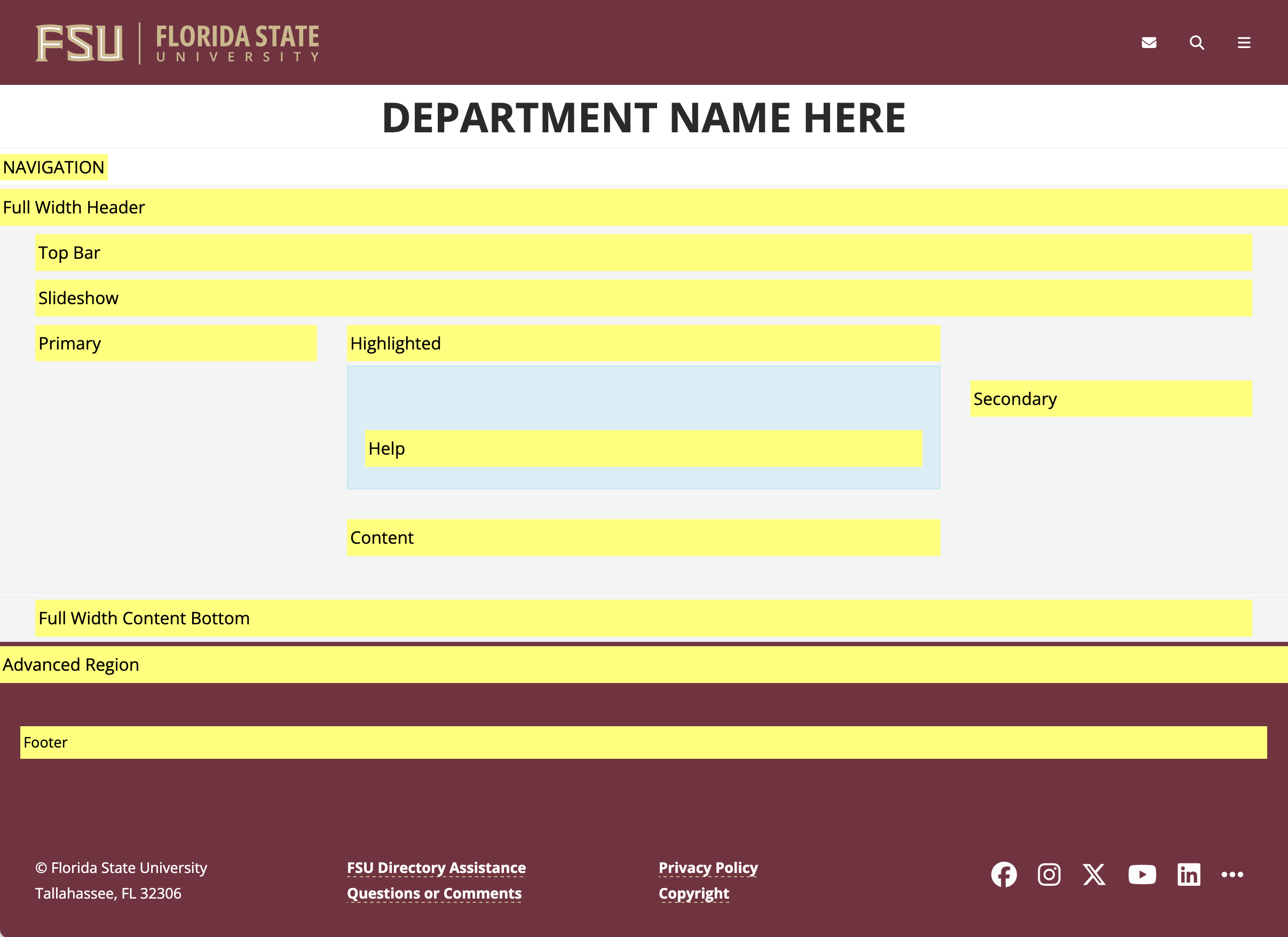
Navigation/Navigation (Collapsible)
This region contains your site's primary navigation. The standard navigation configuration consists of single links that takes users to secondary pages. Alternatively, you may request to have collapsible (dropdown) navigation for your subitems to allow users to select sub-pages from the main menu. Please inform Web Services if you want this function since it requires us to install additional code on your site.
Full Width Header
The Full Width Header region allows you to add a slideshow or photo to your site that spans the entire area of the browser window with no margins to the left or right.
Top Bar
In this region, your site's breadcrumb menu appears for all secondary pages. The region is also used to display status messages and admin actions that are only visible when logged into the site.
Slideshow
This is the default location for your site's slideshow that is typically included on the front page. When using this region, your slideshow will be contained in the main content region of the page, with margins on the left and right.
Primary
The primary region contains your secondary page navigation. It can also be used to display other blocks containing photos and/or text. Please keep in mind that any time this region is used there will be a column that extends the height of the page, unless the Full Width Content Bottom region is used. This is discussed below.
Highlighted
This region is not typically used, but any block placed here will appear below the slideshow or banner and above the main content.
Help
Similar to the Highlighted region, a text block placed here will appear in a blue-tinted container. Again, this region is not typically used.
Secondary
Similar to the Primary region, except blocks placed here will create a column on the right side of the page.
Content
This is the primary region you will use for your content. If the primary and secondary regions contain no blocks this region will render in desktop view as 1168 pixels wide. Otherwise, it will fill the space remaining between the primary and secondary content.
Full Width Content Bottom
When a block is placed here, any white space created by blocks in the primary or secondary regions (i.e., left and right columns) will be reclaimed and the content will once again render at a width of 1168 pixels. Keep in mind that primary and/or secondary regions with a large amount of content may result in the page having an area of undesired white space above the full width content bottom block. So, you should use this block with caution.
Advanced Region
This region is designed for advanced users who are very familiar with HTML. It can be used to add a full-width color block to your page containing a variety of content including text and slideshows. The advanced region renders above the footer region, and by default assumes the background color of the page footer and header.
Footer
Blocks placed in the footer region will render above the default footer. This region can be used for content such as Quick Links, maps, and social media or calendar feeds.
Blocks - Overview
Blocks& are boxes of content rendered into an area, or region, of a web page that can be displayed in regions on your page. Several Custom Blocks have been created for you, but you can also create your own.
How to create a block
- Click on the Content link in the Drupal toolbar at the top of the page.
- Select Blocks from the list.
- Click on the +Add content block button at the top of the page.
- Select General Block or a Custom Block from the list.
- Name the block and add content or Source Code to the Body area. If using a Custom Block region, fill out the fields.
Once a block is created, it must be assigned to a particular region.
Placing a block in a region
- Click on the Structure link in the Drupal toolbar at the top of the page.
- Select Block Layout from the list.
- Scroll down to the region that you want to place the block and click on the Place block button.
- Find your block in the pop-up window and click on the Place block button.
- If you want to move the block to a different region, select and hold the move icon in front of the block and drag it to a different region. Or, go to the region column for that block and select the region from the drop-down.
Individual blocks can be configured to only show/hide on certain pages.
Placing a block on a page
- Click on the Structure link in the Drupal toolbar at the top of the page.
- Select Block Layout from the list.
- Find your block and click on Configure in the Operations column.
- In the left column select Pages, second from the bottom.
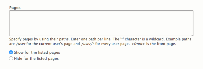
- Specify the pages that you want the block to be visible on by adding the pages path in the Pages field (for example /about). If you have more than one page that you want the block to appear on, make sure to enter one path per line. Add an asterisk to the end of a path, and all pages that start with "about" will have the block (/about*). To place the block on the frontpage only, use <front>. If the Pages filed is left blank, then the block will appear on all pages.
Blocks - Custom Blocks
The FSU Drupal theme offers several custom blocks that are based on University Communications Web Style Guide Strata Three design.
Sliders Promos Featured Box Full Blocks
Sliders
Slider with Banner
Banner height is dependent upon image height.
Slider with Description Below Image
Banner height is dependent upon image height. If all fields are left blank except for the image field, then the slider will just be images.
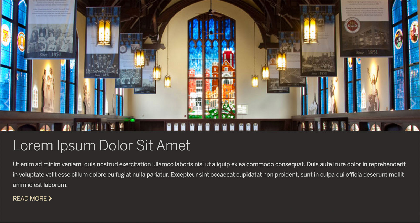
Slider by Thirds
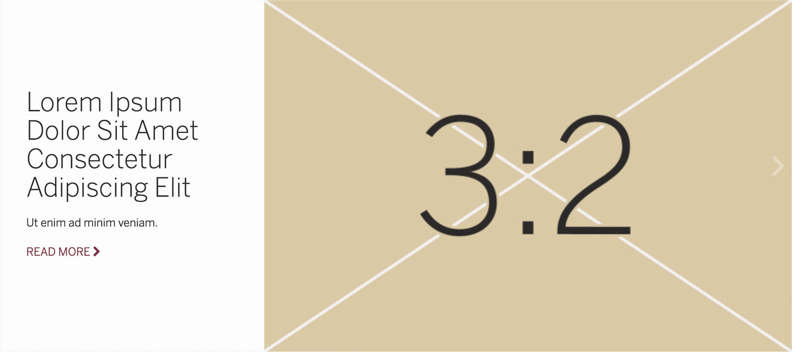
Slider by Halves
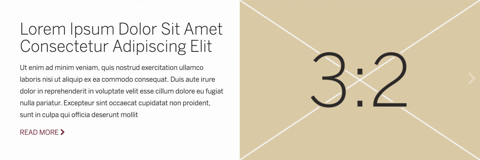
Slider Carousel with Images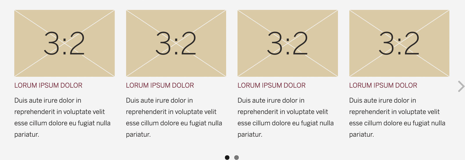
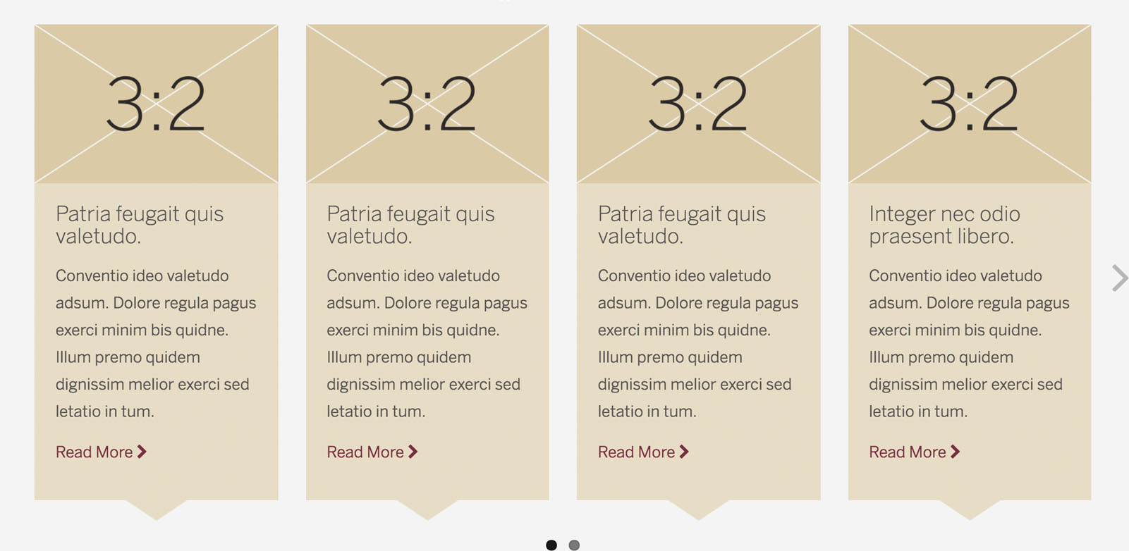
Slider Carousel with Points and Images
This block can have just points or points and images.
Promos
Promo without Images
This block can have a colored background.
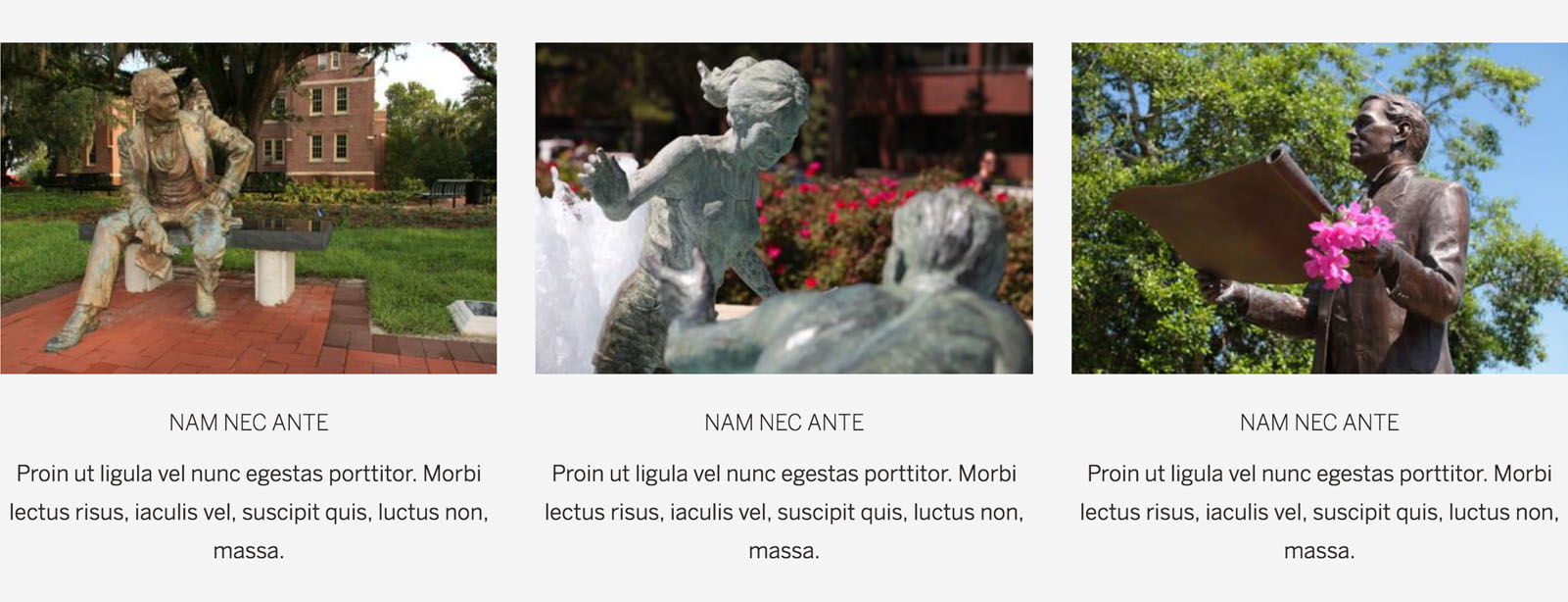
Promo with Images
This block can have a colored background. Choice of image ratios: 1:1, 3:2, 2:1, and round.
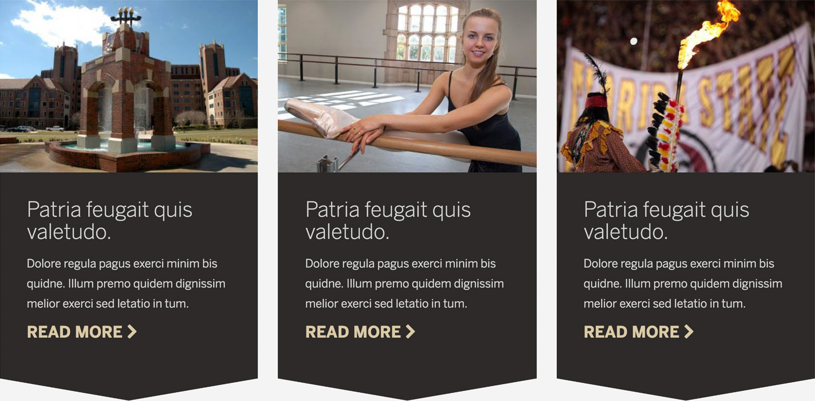
Promo with Points/Arrows and Images
This block can have either points or arrows. It can have a background or no background. Choice of image ratios: 1:1, 3:2, and 2:1.
Promo Image Gallery
Choice of image ratios: 1:1 and 3:2.
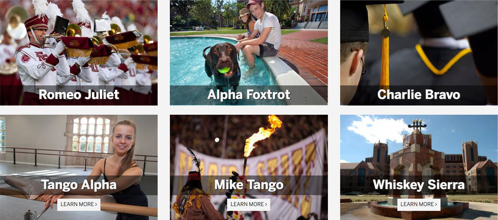
Featured Box - Display News and People
Feature Box 1 Column: Small
This block can have a colored background. Choice of image ratios: 5:4, 4:5, and 1:1.
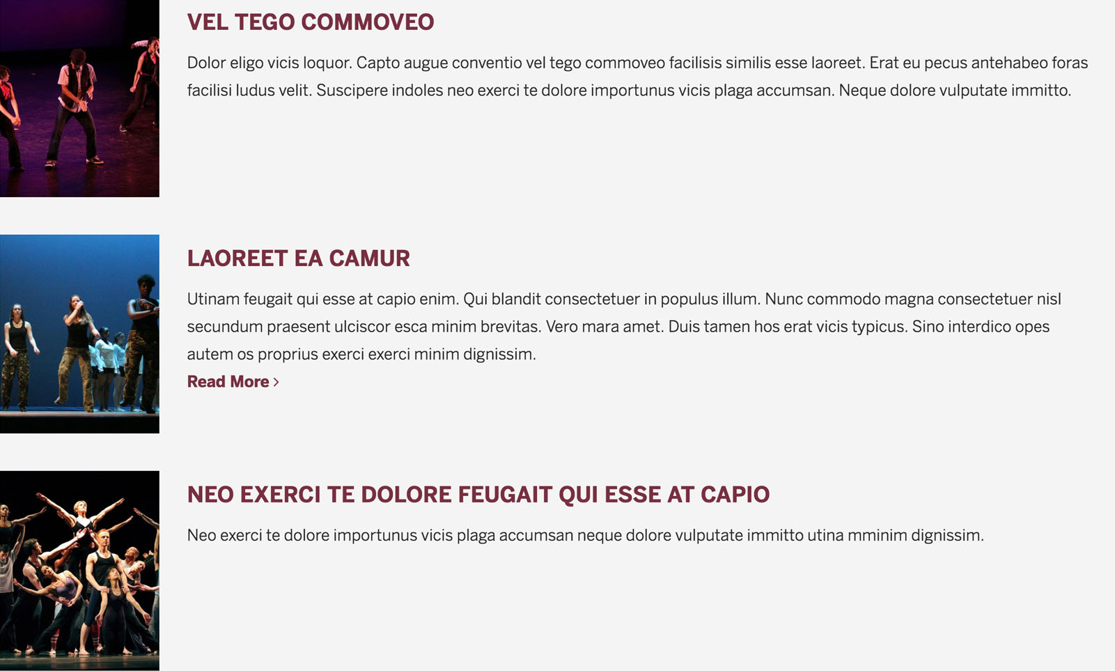
Feature Box 1 Column: Medium
This block can have a colored background. Choice of image ratios: 5:4, 4:5, and 1:1.
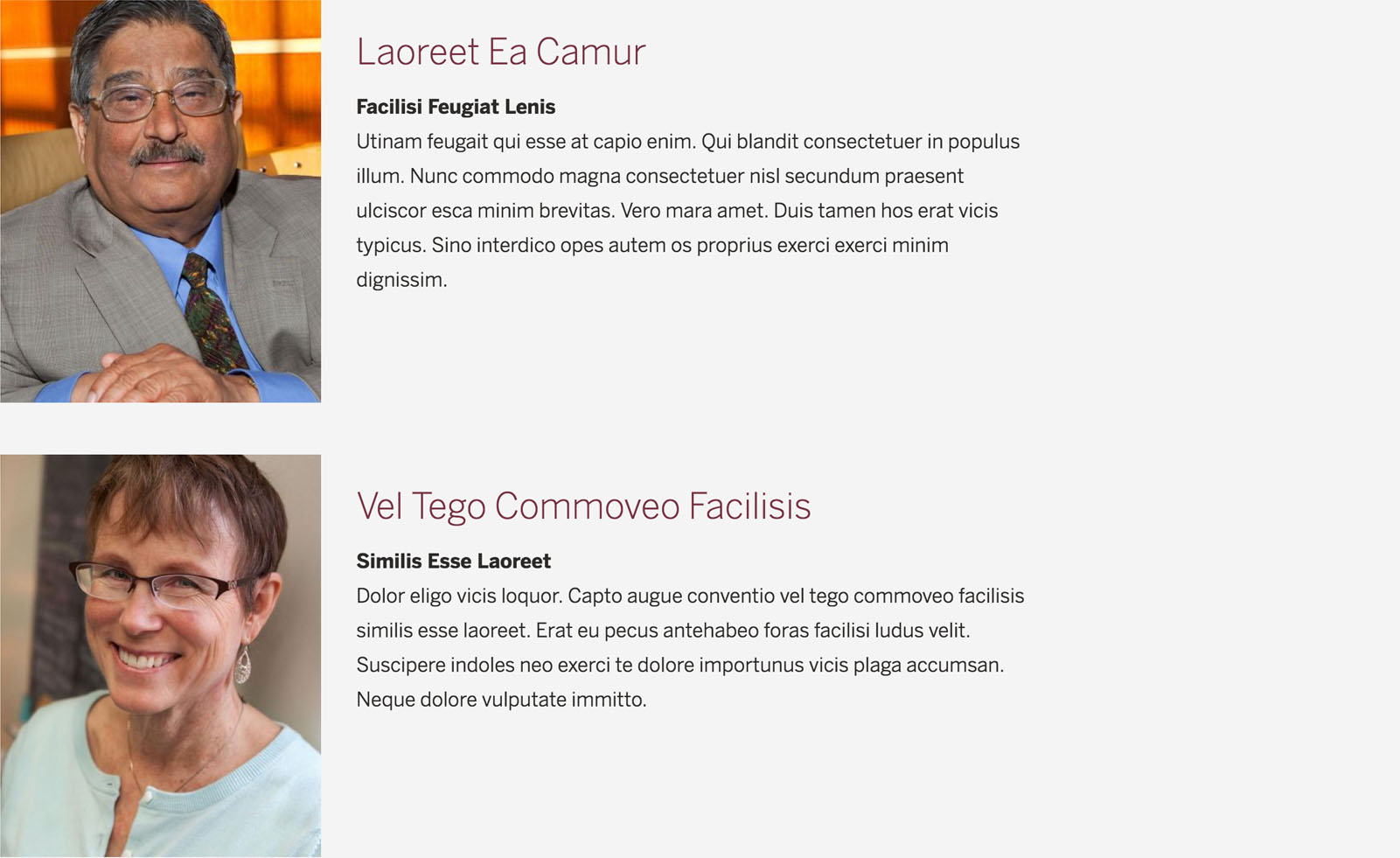
Feature Box 2 Column
This block can have a colored background. Choice of image ratios: 5:4, 4:5, 1:1, 3:2, 16:9, 3:1, and round.
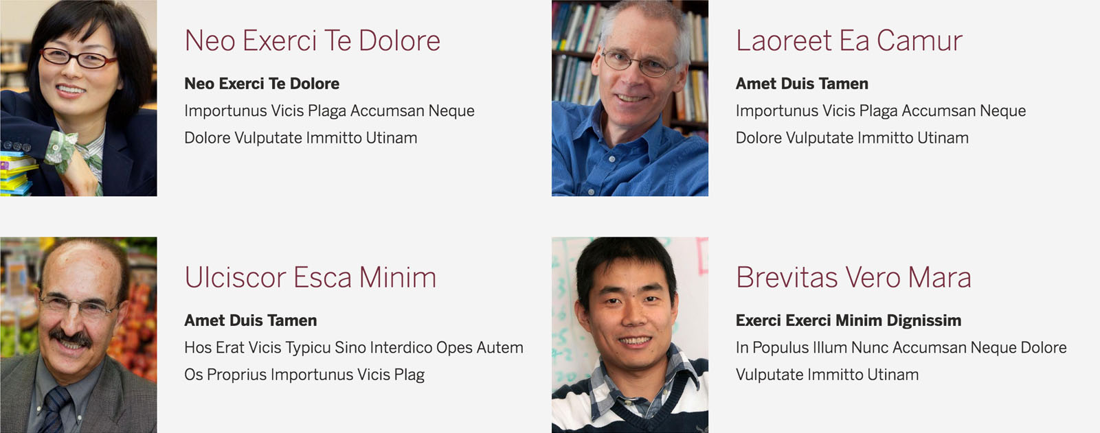
Full Blocks
Full Block with Text
This block has a choice of colors.

Full Block with Image and Text
This block has a choice of colors. Choice of image ratios: 16:9, 5:4, and 3:2.
Info Box
This block is primarily used in the primary and secondary regions, but can be used in the content area.

WYSIWYG Templates
The CKEditor, a visual HTML editor, is sometimes called WYSIWYG editor. In the CKEditor toolbar there is a template function ![]() , which allows a user to select a HTML template from a drop-down and insert it into the WYSIWYG text area. Several templates have been created for you, but you can also create your own. Click on the Configuration link in the Drupal toolbar at the top of the page, then select WYSIWYG templates under the Content Authoring section. Click on +Add template. To add source code, click on Source in the toolbar.
, which allows a user to select a HTML template from a drop-down and insert it into the WYSIWYG text area. Several templates have been created for you, but you can also create your own. Click on the Configuration link in the Drupal toolbar at the top of the page, then select WYSIWYG templates under the Content Authoring section. Click on +Add template. To add source code, click on Source in the toolbar.
How to Upload Images and Replace Image Placeholders
- Navigate to the edit page screen by clicking the New draft tab
- Click the image placeholder, then click the Insert images icon
 in the toolbar
 - Select the folder where you would like to store your image
NOTE: Choose the location of your image file carefully; once it is placed in the file manager it cannot be moved. - Click Upload
- Click Add file
- Select the file you would like to upload from your computer and click Open
NOTE: Use the recommended pixel size and ratio for all images in the template. If you want a different ratio, review the list of preferred image ratios and be sure to change the pixel height only Web Style Guidelines and Resources. - Click Select in the menu bar
Examples
The following examples are displayed at the full width of the container. With the exception of Full Block, the templates will not work within the Advanced Region.
Images with Captions: Two-Up, Three-Up, or Side
Recommended image size: 750(w) x 500(h) pixels for 3:2 and 750(w) x 600(h) pixels for 5:4
Autem iusto praesent lobortis vel euismod ratis.

Secundum proprius praesent diam jugis tation.

Autem iusto praesent lobortis vel euismod ratis.

Secundum proprius praesent diam jugis tation.

Secundum proprius praesent diam jugis tation.

Ut enim ad minim veniam, quis nostrud exercitation ullamco laboris nisi ut aliquip ex ea commodo consequat.
Promo: 2x2-Up
Recommended image size: 700(w) x 1050(h) pixels


Promo: Two-Up, Three-Up, or Four-Up
Sed dignissim lacinia
Morbi in dui quis est pulvinar ullamcorper. Nulla facilisi integer lacinia sollicitudin massa.
Sed dignissim lacinia
Morbi in dui quis est pulvinar ullamcorper. Nulla facilisi integer lacinia sollicitudin massa.
Sed dignissim lacinia
Morbi in dui quis est pulvinar ullamcorper. Nulla facilisi integer lacinia sollicitudin massa.
Sed dignissim lacinia
Morbi in dui quis est pulvinar ullamcorper. Nulla facilisi integer lacinia sollicitudin massa.
Sed dignissim lacinia
Morbi in dui quis est pulvinar ullamcorper. Nulla facilisi integer lacinia sollicitudin massa.
Sed dignissim lacinia
Morbi in dui quis est pulvinar ullamcorper. Nulla facilisi integer lacinia sollicitudin massa.
Sed dignissim lacinia
Morbi in dui quis est pulvinar ullamcorper. Nulla facilisi integer lacinia sollicitudin massa.
Sed dignissim lacinia
Morbi in dui quis est pulvinar ullamcorper. Nulla facilisi integer lacinia sollicitudin massa.
Sed dignissim lacinia
Morbi in dui quis est pulvinar ullamcorper. Nulla facilisi integer lacinia sollicitudin massa.
Promo With Points: Two-Up, Three-Up, or Four-Up
Patria feugait quis valetudo.
Conventio ideo valetudo adsum. Dolore regula pagus exerci minim bis quidne. Illum premo quidem dignissim melior exerci sed letatio in tum.
Patria feugait quis valetudo.
Conventio ideo valetudo adsum. Dolore regula pagus exerci minim bis quidne. Illum premo quidem dignissim melior exerci sed letatio in tum.
Patria feugait quis valetudo.
Conventio ideo valetudo adsum. Dolore regula pagus exerci minim bis quidne. Illum premo quidem dignissim melior exerci sed letatio in tum.
Patria feugait quis valetudo.
Conventio ideo valetudo adsum. Dolore regula pagus exerci minim bis quidne. Illum premo quidem dignissim melior exerci sed letatio in tum.
Patria feugait quis valetudo.
Conventio ideo valetudo adsum. Dolore regula pagus exerci minim bis quidne. Illum premo quidem dignissim melior exerci sed letatio in tum.
Patria feugait quis valetudo.
Conventio ideo valetudo adsum. Dolore regula pagus exerci minim bis quidne. Illum premo quidem dignissim melior exerci sed letatio in tum.
Patria feugait quis valetudo.
Conventio ideo valetudo adsum. Dolore regula pagus exerci minim bis quidne. Illum premo quidem dignissim melior exerci sed letatio in tum.
Patria feugait quis valetudo.
Conventio ideo valetudo adsum. Dolore regula pagus exerci minim bis quidne. Illum premo quidem dignissim melior exerci sed letatio in tum.
Patria feugait quis valetudo.
Conventio ideo valetudo adsum. Dolore regula pagus exerci minim bis quidne. Illum premo quidem dignissim melior exerci sed letatio in tum.
Promo With Arrows: Two-Up, Three-Up, or Four-Up
Patria feugait quis valetudo.
Conventio ideo valetudo adsum. Dolore regula pagus exerci minim bis quidne. Illum premo quidem dignissim melior exerci sed letatio in tum.
Patria feugait quis valetudo.
Conventio ideo valetudo adsum. Dolore regula pagus exerci minim bis quidne. Illum premo quidem dignissim melior exerci sed letatio in tum.
Patria feugait quis valetudo.
Conventio ideo valetudo adsum. Dolore regula pagus exerci minim bis quidne. Illum premo quidem dignissim melior exerci sed letatio in tum.
Patria feugait quis valetudo.
Conventio ideo valetudo adsum. Dolore regula pagus exerci minim bis quidne. Illum premo quidem dignissim melior exerci sed letatio in tum.
Patria feugait quis valetudo.
Conventio ideo valetudo adsum. Dolore regula pagus exerci minim bis quidne. Illum premo quidem dignissim melior exerci sed letatio in tum.
Patria feugait quis valetudo.
Conventio ideo valetudo adsum. Dolore regula pagus exerci minim bis quidne. Illum premo quidem dignissim melior exerci sed letatio in tum.
Patria feugait quis valetudo.
Conventio ideo valetudo adsum. Dolore regula pagus exerci minim bis quidne. Illum premo quidem dignissim melior exerci sed letatio in tum.
Patria feugait quis valetudo.
Conventio ideo valetudo adsum. Dolore regula pagus exerci minim bis quidne. Illum premo quidem dignissim melior exerci sed letatio in tum.
Patria feugait quis valetudo.
Conventio ideo valetudo adsum. Dolore regula pagus exerci minim bis quidne. Illum premo quidem dignissim melior exerci sed letatio in tum.
Promo With Images: Two-Up, Three-Up, or Four-Up
Recommended image size: 750(w) x 500(h) pixels

Sed dignissim lacinia
Morbi in dui quis est pulvinar ullamcorper. Nulla facilisi integer lacinia sollicitudin massa.

Sed dignissim lacinia
Morbi in dui quis est pulvinar ullamcorper. Nulla facilisi integer lacinia sollicitudin massa.

Sed dignissim lacinia
Morbi in dui quis est pulvinar ullamcorper. Nulla facilisi integer lacinia sollicitudin massa.

Sed dignissim lacinia
Morbi in dui quis est pulvinar ullamcorper. Nulla facilisi integer lacinia sollicitudin massa.

Sed dignissim lacinia
Morbi in dui quis est pulvinar ullamcorper. Nulla facilisi integer lacinia sollicitudin massa.

Sed dignissim lacinia
Morbi in dui quis est pulvinar ullamcorper. Nulla facilisi integer lacinia sollicitudin massa.

Sed dignissim lacinia
Morbi in dui quis est pulvinar ullamcorper. Nulla facilisi integer lacinia sollicitudin massa.

Sed dignissim lacinia
Morbi in dui quis est pulvinar ullamcorper. Nulla facilisi integer lacinia sollicitudin massa.

Sed dignissim lacinia
Morbi in dui quis est pulvinar ullamcorper. Nulla facilisi integer lacinia sollicitudin massa.
Promo With Images: Three-Up With Description
Recommended image size: 700(w) x 875(h) pixels
Nobis diam autem cui suscipere.
Blandit hos oppeto amet. Ideo ex odio luptatum defui. Abigo veniam pala volutpat quadrum velit in vulpes enim indoles aptent. Blandit hos oppeto amet. Ideo ex odio luptatum defui. Abigo veniam pala volutpat quadrum velit in vulpes enim indoles aptent.

Lorum Ipsum

Lorum Ipsum

Lorum Ipsum
Promo With Icons: Two-Up, Three-Up, or Four-Up
Recommended image size: 500(w) x 500(h) pixels. Image ratio must be 1:1.
Sed dignissim lacinia
Morbi in dui quis est pulvinar ullamcorper. Nulla facilisi integer lacinia sollicitudin massa.
Sed dignissim lacinia
Morbi in dui quis est pulvinar ullamcorper. Nulla facilisi integer lacinia sollicitudin massa.
Sed dignissim lacinia
Morbi in dui quis est pulvinar ullamcorper. Nulla facilisi integer lacinia sollicitudin massa.
Sed dignissim lacinia
Morbi in dui quis est pulvinar ullamcorper. Nulla facilisi integer lacinia sollicitudin massa.
Sed dignissim lacinia
Morbi in dui quis est pulvinar ullamcorper. Nulla facilisi integer lacinia sollicitudin massa.
Promo With Circular Images: Two-Up, Three-Up, or Four-Up
Recommended image size: 500(w) x 500(h) pixels. Image ratio must be 1:1.
Sed dignissim lacinia
Morbi in dui quis est pulvinar ullamcorper. Nulla facilisi integer lacinia sollicitudin massa.
Sed dignissim lacinia
Morbi in dui quis est pulvinar ullamcorper. Nulla facilisi integer lacinia sollicitudin massa.
Sed dignissim lacinia
Morbi in dui quis est pulvinar ullamcorper. Nulla facilisi integer lacinia sollicitudin massa.
Sed dignissim lacinia
Morbi in dui quis est pulvinar ullamcorper. Nulla facilisi integer lacinia sollicitudin massa.
Sed dignissim lacinia
Morbi in dui quis est pulvinar ullamcorper. Nulla facilisi integer lacinia sollicitudin massa.
Promo With Points and Images: Two-Up, Three-Up, or Four-Up
Recommended image size: 750(w) x 500(h) pixels

Patria feugait quis valetudo.
Conventio ideo valetudo adsum. Dolore regula pagus exerci minim bis quidne. Illum premo quidem dignissim melior exerci sed letatio in tum.

Patria feugait quis valetudo.
Conventio ideo valetudo adsum. Dolore regula pagus exerci minim bis quidne. Illum premo quidem dignissim melior exerci sed letatio in tum.

Patria feugait quis valetudo.
Conventio ideo valetudo adsum. Dolore regula pagus exerci minim bis quidne. Illum premo quidem dignissim melior exerci sed letatio in tum.

Patria feugait quis valetudo.
Conventio ideo valetudo adsum. Dolore regula pagus exerci minim bis quidne. Illum premo quidem dignissim melior exerci sed letatio in tum.

Patria feugait quis valetudo.
Conventio ideo valetudo adsum. Dolore regula pagus exerci minim bis quidne. Illum premo quidem dignissim melior exerci sed letatio in tum.

Patria feugait quis valetudo.
Conventio ideo valetudo adsum. Dolore regula pagus exerci minim bis quidne. Illum premo quidem dignissim melior exerci sed letatio in tum.

Patria feugait quis valetudo.
Conventio ideo valetudo adsum. Dolore regula pagus exerci minim bis quidne. Illum premo quidem dignissim melior exerci sed letatio in tum.

Patria feugait quis valetudo.
Conventio ideo valetudo adsum. Dolore regula pagus exerci minim bis quidne. Illum premo quidem dignissim melior exerci sed letatio in tum.

Patria feugait quis valetudo.
Conventio ideo valetudo adsum. Dolore regula pagus exerci minim bis quidne. Illum premo quidem dignissim melior exerci sed letatio in tum.
Promo With Arrows and Images: Two-Up, Three-Up, or Four-Up
Recommended image size: 750(w) x 500(h) pixels

Patria feugait quis valetudo.
Conventio ideo valetudo adsum. Dolore regula pagus exerci minim bis quidne. Illum premo quidem dignissim melior exerci sed letatio in tum.

Patria feugait quis valetudo.
Conventio ideo valetudo adsum. Dolore regula pagus exerci minim bis quidne. Illum premo quidem dignissim melior exerci sed letatio in tum.

Patria feugait quis valetudo.
Conventio ideo valetudo adsum. Dolore regula pagus exerci minim bis quidne. Illum premo quidem dignissim melior exerci sed letatio in tum.

Patria feugait quis valetudo.
Conventio ideo valetudo adsum. Dolore regula pagus exerci minim bis quidne. Illum premo quidem dignissim melior exerci sed letatio in tum.

Patria feugait quis valetudo.
Conventio ideo valetudo adsum. Dolore regula pagus exerci minim bis quidne. Illum premo quidem dignissim melior exerci sed letatio in tum.

Patria feugait quis valetudo.
Conventio ideo valetudo adsum. Dolore regula pagus exerci minim bis quidne. Illum premo quidem dignissim melior exerci sed letatio in tum.

Patria feugait quis valetudo.
Conventio ideo valetudo adsum. Dolore regula pagus exerci minim bis quidne. Illum premo quidem dignissim melior exerci sed letatio in tum.

Patria feugait quis valetudo.
Conventio ideo valetudo adsum. Dolore regula pagus exerci minim bis quidne. Illum premo quidem dignissim melior exerci sed letatio in tum.

Patria feugait quis valetudo.
Conventio ideo valetudo adsum. Dolore regula pagus exerci minim bis quidne. Illum premo quidem dignissim melior exerci sed letatio in tum.
Promo Image Gallery: Six-Up or Twenty-Up
Recommended image size: 400(w) x 400(h) pixels for 1:1 ratio, 750(w) x 500(h) pixels for 3:2



Qui blandit consectetuer

Secundum praesent ulciscor

exerci te dolore importunus

Duis tamen hos erat vicis

Qui blandit consectetuer

Secundum praesent ulciscor

exerci te dolore importunus

Duis tamen hos erat vicis

Qui blandit consectetuer

Secundum praesent ulciscor

exerci te dolore importunus

Duis tamen hos erat vicis

Qui blandit consectetuer

Secundum praesent ulciscor

exerci te dolore importunus

Duis tamen hos erat vicis

Qui blandit consectetuer

Secundum praesent ulciscor

exerci te dolore importunus

Duis tamen hos erat vicis
Feature Box 1 Column: Small, Medium, or Large
Recommended image size: 400(w) x 500(h) pixels for 4:5 and 750(w) x 600(h) pixels for 5:4

Laoreet Ea Camur
Utinam feugait qui esse at capio enim. Qui blandit consectetuer in populus illum. Nunc commodo magna consectetuer nisl secundum praesent ulciscor esca minim brevitas. Vero mara amet. Duis tamen hos erat vicis typicus. Sino interdico opes autem os proprius exerci exerci minim dignissim.
Read More

Laoreet Ea Camur
Facilisi Feugiat Lenis
Utinam feugait qui esse at capio enim. Qui blandit consectetuer in populus illum. Nunc commodo magna consectetuer nisl secundum praesent ulciscor esca minim brevitas. Vero mara amet. Duis tamen hos erat vicis typicus. Sino interdico opes autem os proprius exerci exerci minim dignissim.
Read More

Commoveo te a neque amet paratus.
Commoveo te a neque amet paratus.
Feugait magna singularis iustum causa neo turpis plaga genitus. Ratis a sed a. Nutus melior in duis esse probo amet importunus eros macto wisi. Eum tation ad duis aliquam verto vel. Lucidus roto praesent plaga importunus dolor vulpes importunus lucidus.
Feature Box 2 Column
Recommended image size: 400(w) x 500(h) pixels

Brevitas Vero Mara
Enim Qui Blandit Consectetuer
In Populus Illum Nunc >Commodo Magna Consectetuer Nisl Secundum Praesent

Laoreet Ea Camur
Amet Duis Tamen
Importunus Vicis Plaga Accumsan Neque Dolore Vulputate Immitto Utinam
Full Block
To change the color of the box: click on the Source button in the toolbar. In the first line of code,<div class="s3-p-10 s3-gd1c">, change the bolded text to a different Strata color. The Strata color code names can be found here.
Commoveo te a neque amet paratus.
Commoveo te a neque amet paratus.
Feugait magna singularis iustum causa neo turpis plaga genitus. Ratis a sed a. Nutus melior in duis esse probo amet importunus eros macto wisi. Eum tation ad duis aliquam verto vel. Lucidus roto praesent plaga importunus dolor vulpes importunus lucidus.
Custom Link Text
The example below includes Font Awesome icons, which you can either change or delete as you wish. To delete them just edit the source code and remove each tag, for instance:
<span class="fa fa-calendar"> </span>
If you wish to have icons but want to change them, you can find the icon you want using the Font Awesome Cheatsheet. Simply edit the code and change the "fa-calendar" name in the example above to the desired icon name.
Fugiat Nulla Pariatur
Footer Link Text
Lorem Ipsum Dolor
Consectetur Adipiscing Elit
Sed Do Eiusmod
Ut Enim Ad Minim
Aliqua Ut Enim
Ex Ea Commodo Consequat
Accordion
Recommended Use: There are 2 accordion templates: 5, 10. Choose the template that has the closest amount of accordions that you need, to the highest number. If you need to remove one or more accordions, click on the Source button in the toolbar and remove the following code (for removal of one accordion):
<h4 class="accordion_title">Accordion Content Heading 3</h4>
<div class="accordion-content">
<p>This is content that will expand when the heading is clicked.</p>
</div>
Accordion Content Heading 1
This is content that will expand when the heading is clicked.
Accordion Content Heading 2
This is content that will expand when the heading is clicked.
Accordion Content Heading 3
This is content that will expand when the heading is clicked.
Accordion Content Heading 4
This is content that will expand when the heading is clicked.
Accordion Content Heading 5
This is content that will expand when the heading is clicked.
Training Videos
Drupal has a large support community and lots of online resources to help you learn your way around. Please follow the link below to sign up for online Drupal courses through Acquia Academy.
LOGIN NOTE: When you sign up for Acquia training, enter your fsu.edu email address for Username, create any password you like,and enter fsu.edu for Sitename.
Acquia Academy: https://customers.acquiacademy.com/index
Brand Resources & Downloads
Please see the University Communications Branding website for information on FSU Branding and Web Templates.
Need to make sure you are incorporating the graphic elements described in the brand guidelines before submitting for brand review? Make sure to access the tool kit below for help or contact the Creative Services department for assistance.
Other FSU Webmaster links:
- Join our email lists.
- Web Content Management System (WCMS)
- w3 Schools
- Training and Tutorials
- Removing URLs from the web - About Removing URLs
Accessibility & Validation:
- Siteimprove offered by FSU ITS
- Siteimprove Accessibility Checker for Chrome (plugin)
- Test color contrast
- Tenon Accessibility Checker
- W3C Markup Validation Service
- W3C Web Accessibility Evaluation Tools: Overview
- http://wave.webaim.org/
- Accessibility for Higher Ed
- Chrome Lighthouse - Chrome plugin web tool - accessibility and performance checker
Widgets and Goodies:
** Florida State University is not responsible to loss of data or any harm due to use of link listed on this page. They are provided as references.
FSU WCMS (DRUPAL)
- Drupal meets accessibility guidelines.
If anyone needs help with accessibility problems, they can contact its-webservices@fsu.edu. Problems are generally limited to content-owner input, like missing alt tags. - FSU WCMS updates: https://lists.fsu.edu/mailman/listinfo/fsucms
FSU Webmasters
- FSU Webmasters updates: https://lists.fsu.edu/mailman/listinfo/webmasters
Make your site Public
Once you have uploaded all your content and everything looks good to go, Web Services will help you make your website public. Please allow up to five business days for your site to be public.
Content Owners' Responsibilities
- Look at the previous site's URL and determine which links need to be forwarded. You will also need to be sure that virtual links refer to pages within the site, not hard coded links which include "acsitefactory" in the URL.
- Departments should consider old pages that visitors may have bookmarked, and the new pages that they should link to, then the ITS Web Team can show the department contact how to create a URL alias for those links so they won't be broken.
- Run site through the accessibility validator at: Siteimprove (Your site may need to be crawled and that could take up to five days)
Google Analytics
- Get a Departmental Gmail Account
You will be able to track your website using Google Analytics (GA) provided you have a Departmental Gmail Account with access to www.fsu.edu in GA. If you do not have a Gmail account, please set one up (example: FSU-HumanSciences@gmail.com). - Create a ticket
For access to GA, please visit the Service Center website and open a case. Please include your Department's Gmail address (not a personal account) and request that it be added to the Google Analytics user list.
Going Public:


